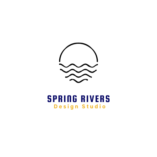
When you hear the name “Spring Rivers” for the first time, you probably don’t know what it stands for or why I decided to use this name as my brand name. In this brief, I’ll be talking about how I came up with the inspiration for the entire logo that I’ve designed for this brand.
I had several names in mind for my brand, but in my opinion, Spring Rivers was always the name that stuck in my head. The reason I chose this name was very simple and very ironic to its true meaning; Spring is the beginning of a new season, and this brand I’ve created reminds me of that. I grew up with different dreams of pursuing my passion, but now I’ve decided to become a Graphic Designer, and this brand will help set me up for success.
One of the meanings of a river that resonates with me the most is that it is a passageway, much like a road that leads to a new world. To me, a river can represent changes in values, personalities, and morality. Similarly to how I chose spring as a symbol, rivers personally symbolize how there may be many twists and turns in life, but in the end, the struggle to achieve your goals will be worth it. The waters of the river eventually connect to the ocean, just like how our journey through life will eventually lead us to where we’re meant to be.
I have deliberately kept the logo of my brand simple to avoid adding too much detail to it. The logo is an outline of a sunset, reflecting my love for nature, and it includes the brand name “Spring Rivers”. In terms of typography, I opted for a font called “Squada One” that is bold yet simple and easy to read. For the color scheme, I mainly used Royal Blue, Yellow, Black, and White.

