‘What Made Me Here’

INTRODUCTION

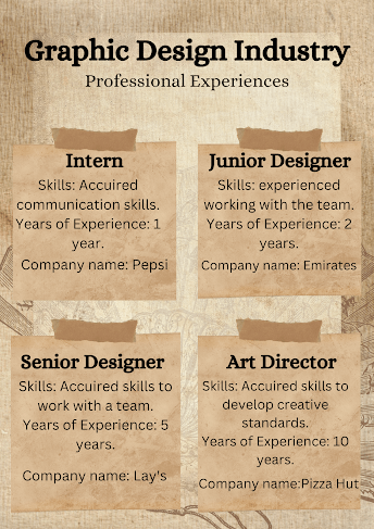
Hello, I’m Doreen and I’m happy to say that I have dedicated my career and passion into Visual Arts. I have always held a passion to express emotions and connect with other people through my artworks, be it on paper or even digitally. I have worked as a Junior Designer with Pepsi for 3 years and as a Senior Designer of Emirates for 5 years now, which in total, have 8 years of working experience with graphic design industry. I have also sold my own illustration on various famous websites and made a lot of connections with other graphic designers in the process which helped in my growth of expertise in visual arts. My works have been known for how I can connect with people through my work and how much passion I put into making it the best of my ability.

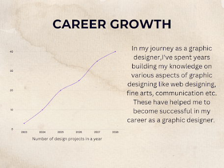
My Journey As A Graphic Designer:

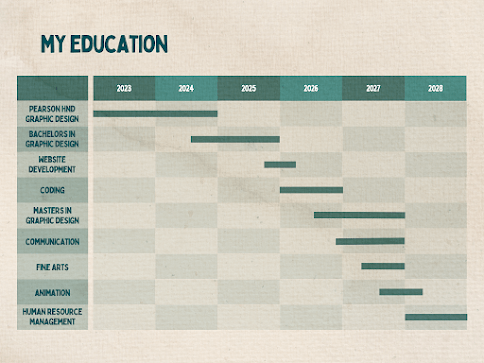
I realized my passion for Graphic Designing when I was skill in my school years. After school I joined Explore Education Institute in 2023 after I was done with school for Higher National Diploma for Graphic Designing. During this course I got the opportunity to gain work experience through different internship opportunities offered by the institute and had the chance to attend different workshops for the same too.

In 2024, I got the opportunity to work as a Junior Designer for Pepsi for 3 years where I got to gain a lot of experience and broadened my creative horizons working with a team and contributing my own ideas to different projects. In 2029, I got the opportunity to work as a Senior Designer in Emirates for 5 years now. My aim currently is to become an Art Director in Illustrations and to take on bigger projects in the future. I truly enjoy how I am able to bring all of my work to life through my creativity and creating works that’s makes other people what I feel through the artworks I create digitally.

History Of The Graphic Design Industry

Graphic Design is the combination of elements that carry the majority of the overall content in both worlds—the digital world and the printed—where the words and pictures are the building blocks of graphic design. As graphic design is becoming more visible and important in our lives, the designer’s task is to combine visual and verbal elements in order to develop an effective concept. “Graphic design is a combined profession where writers produce words, and photographers and illustrators create images from that the designer incorporates the whole idea in an orderly format into a complete visual communication.” The evolution of graphic design as a professional practice has been developed through its technological innovations and the visual imagination of the designers as per the requirements. Graphic design has been practiced throughout history in various forms, such as from manuscripts to printing and book production, advances in graphic design developed over the period. 

Assignment Brief

Scenario:

ASSIGNMENT BREIF: Emirates are planning to revamp their logo and corporate livery. They want to stay accessible and must retain the red company color throughout but want to update their logo along with the styling across all of their products including everything from aero plane paintwork to the uniforms and ticket styling. Your design company will be one of the companies to pitch an identity proposal. Emirates are accepting proposals for the contract through a pitch, style guide and mock-ups of what the products may look like.

The submission is in two parts:

1. Pitch should be approx 10 minutes: 

2. A style guide (600-1000 words approx.):

MY ASSIGNMENT DIARY 

NAME: DOREEN SARA DERRICK

UNIT: BRANDING AND IDENTITY

Course: Pearsons BTEC L5-Art & Design – Graphic Design

DateActivitiesReferences
20/05/2023Introduced with Assignment brief.I have started the work with a research on how the provided brand is started and the historical background.Brand typography Brand logoEmirates typography – Google Search
21/05/2023Pitch is done 
22/05/2023Today I started working on the brand typography and logo. I found the logo i wanted to use for the logo and started creating my logo.https://www.fontspace.com/search?q=alex%20brush
24/05/2023Continued creating the logo on canva and started working on the style guide for emirates. 
26/05/2023Finished the new logo for Emirates and started working on mockups for Emirates. Continuing the completion of the Emirates style guide.https://smartmockups.com/mockups/pillowshttps://www.freepik.com/search?format=search&query=flight%20livery
27/05/2023Finished the pitch presentation and am continuing working on style guide.
31/05/2023Works on the pitch for emirates and researches on the emirates airlines history. Continues working on style guide.https://en.wikipedia.org/wiki/Emirates_(airline)
02/06/2023Finished making the emirates style guide and preparation for pitch.
03/06/2023Presented the pitch for the Emirates airlines and submitted the emirates style guide.
  

Case Study

Task:

Case Study on any brand (in 20 slides for presentation) by taking reference from the brand discussed in the class.

TOPIC SELECTED: M&M’s

Points to be included:

 Branding Process

– Brand Logo & Typography

– Visual Identity of thr Brand

– Creating a brand book

– Analysis of historical and contemporary contextual research

Case study report with flipbook online

Case study Pitch – classroom presentation

About My Work:

What made me choose this brand?

I chose this brand because of its interesting history and my curiosity as to how this brand or M&M’s came to be what it is today.

My findings?

During my research, I discovered a lot about the history of the M&M’s brand and how it was established. I learned about the evolution of the M&M’s logo over time, as well as their advertising strategy and the Pantone color palette used for their colors.

Links used:

https://en.wikipedia.org/wiki/M%26M%27s

My prespectives

From my perspective, I feel that M&M’s has created a unique name for itself by using an idea that no other candy or chocolate had used until recently. In my opinion, M&M’s has an interesting history that has truly caught my attention and curiosity throughout my research. The way they created different characters of the candy with vibrant colors and different personalities grabbed the attention of many consumers. Advertising with these characters and bringing them to life has brought a lot of attention to the brand.

Any suggestions for the brand

As far as I’m concerned, the brand has already established itself and has garnered a strong following among many customers. However, I believe that M&M’s should continue to use advertising as a means to reach out to potential customers who may not have heard of the product yet. This would pique their interest and potentially increase brand loyalty.

Assigned Date: 06.05.2023

Submitted Date: 20.05.2023

Spring Rivers Brand Logo

When you hear the name “Spring Rivers” for the first time, you probably don’t know what it stands for or why I decided to use this name as my brand name. In this brief, I’ll be talking about how I came up with the inspiration for the entire logo that I’ve designed for this brand.

I had several names in mind for my brand, but in my opinion, Spring Rivers was always the name that stuck in my head. The reason I chose this name was very simple and very ironic to its true meaning; Spring is the beginning of a new season, and this brand I’ve created reminds me of that. I grew up with different dreams of pursuing my passion, but now I’ve decided to become a Graphic Designer, and this brand will help set me up for success.

One of the meanings of a river that resonates with me the most is that it is a passageway, much like a road that leads to a new world. To me, a river can represent changes in values, personalities, and morality. Similarly to how I chose spring as a symbol, rivers personally symbolize how there may be many twists and turns in life, but in the end, the struggle to achieve your goals will be worth it. The waters of the river eventually connect to the ocean, just like how our journey through life will eventually lead us to where we’re meant to be.

I have deliberately kept the logo of my brand simple to avoid adding too much detail to it. The logo is an outline of a sunset, reflecting my love for nature, and it includes the brand name “Spring Rivers”. In terms of typography, I opted for a font called “Squada One” that is bold yet simple and easy to read. For the color scheme, I mainly used Royal Blue, Yellow, Black, and White.

Design a site like this with WordPress.com
Get started